.png)
Meet LOOMO: OOBE (Out-of-box Experience)
Build Emotional Connections from the First Meet
I designed Out of Box Experience for LOOMO, including a spontaneously interactive tutorial conducted by LOOMO and instructions about out of package and starting up.
Goals for OOBE
1. allowing users to master the basic operations of LOOMO
2. establish positive emotional connections.
How the OOBE did you might ask? People’s sharing on Youtube explains everything.

Ideation
User Journey
The process of unpacking and setting up for intelligent device is a lengthy and complicated process that consists of many steps. Some of the steps are difficult and can easily cause a bad experience for users.

What I Found:
The pre-ordered customers have high expectations for LOOMO, however, the complicated and difficult steps make their enthusiasm gradually decline. More Learning Costs required in the OOBE steps, less excitement users have.

Why not use a delightful teaching way triggered by LOOMO itself?

+ Quickly view key points
+ Catch user’s eye
- Limited coverage
Guide Pages
+ Comprehensive content
+ Contains safety instructions
- Many users do not read the instructions
Instruction Manual
Traditional instruction methods we have now
Spontaneously interactive tutorial conducted by LOOMO itself

- Quickly establish emotional connections with users
- Deliver the introductions of basic operations
- Arouse users' interest in product features
Design Flow
Experience Flow

Formulation
Although LOOMO has a bunch of functions, the first step is to choose which feature should be taught in the tutorial. The chosen feature should be initial, easy to learn.

Deliverables
The interactive tutorial could use all robot feedback to conduct a live show, including Voice iInteraction, Robot Lighting, Robot Movement, User Interface & animation.
Script
Click to view full size

How does it Work?
Interaction Flow

Click to view full size
Here I show three steps in the complete tutorial.
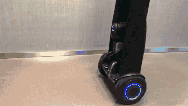
Launcher
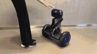


Pushing Sensor Instruction
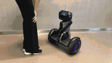


Riding Instruction


APP: Tutorial Start and Skip
The linkage design of the robot APP also needs to be considered. The tutorial is activated after connecting network and APP, at that time user are paying attention to the robot APP. The APP will lead user to start tutorial and pay attention to robot.
If the user is not convenient to try tutorial at this time, the tutorial can be skipped with APP.
User Testing
“Good product never excluding end users from the design process.”

For collecting real user needs and feedbacks, our team organized internal testing for Interactive Tutorial.
Internal test is initiated every two weeks, each containing at least 5 testers close to the product portrait .
Listen to the end users
What I Got from the User Testing
Because some tutorial steps required specified operation to pass, test users are easy to get stuck in the some step:
Push touch sensor: Difficult to trigger push touch sensor
Exit touch mode before pushing displacement
Difficult to stabilize touch mode
Voice waken/voice command: If the voice recognition peogram is collapse, the process cannot continue
Auto-shot: If the camera module cannot be turned on, the process cannot continue
Iteration: Leave Room for User Error
As the tutorial process becomes more strict, the user's learning effectiveness gradually increases, but too strict tutorial will lead to negative user experience.

For the iteration, I strengthened the error tolerance of users in operation flow, if the user didn't pass certain task, after 3 time he will automatically go next step.
After the change, users get less frustration to enhance the experience. After the change, the user will never be stuck in certain step.

Evaluation: How did the iterations work?
After 6 iterations and inner testings in loops, in general product testing of May 2018, the interactive tutorial was the most satisfactory and favorite feature.

Excerpt from May 2017 internal test report
Evaluation Standard: SUS(System Usability Scale)
The SUS provides a “quick and dirty”, reliable tool for measuring the usability. It consists of a 10 item questionnaire with five response options for respondents; from Strongly agree to Strongly disagree. Originally created by John Brooke in 1986.

Calculating method:
Determine the conversion score for each question, ranging from 0-4, with an average score of Xi for each question.
Conversion scores calculating:
For the positive questions: original score minus 1 (Xi-1), for the negative questions: 5 minus original score (5- Xi).
Total SUS score: added all conversion scores and multiplied by 2.5 . (Ranges from 0 to 100 and is divided into 2.5 increments.)

SUS of Interactive Tutorial
